
ignant. is an eclectic brand that explores facets of the English language. The term is a shorthand version of the word 'ignorant’. It dissects the anatomy of typography & reinterprets explicit insults though a linguistically polarizing fashion. It originated as a joke from the film Malibu’s Most Wanted.

FONT
THE ART OF TYPOGRAPHY
Typography is essential to graphic designers. Stylizing fonts can simultaneously relay information, create visual movement & set the tone for a project by evoking emotions.
ANATOMICAL BREAKDOWN
Fonts should be legible with a distinctive flare & carry a consistent structure. The chart (designed by Martin Silvertant) is a great overview on contemporary fonts.


ELEMENTS & EXPANSION


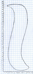
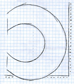
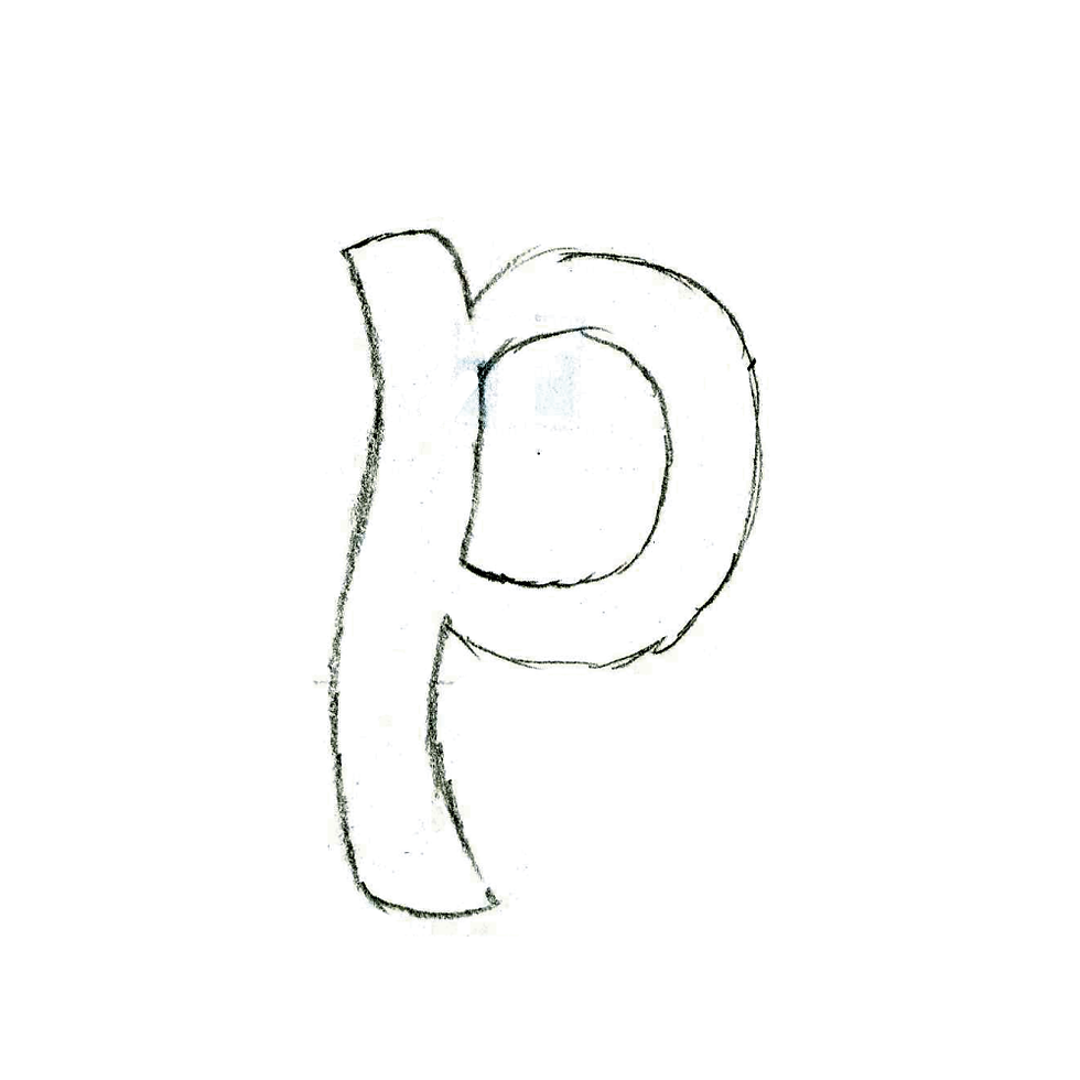
I deconstructed several fonts to their “bare bones” & found various patterns in between letters. The sketches have essential to shapes to creating all letters. The line-up expanded to create others that could be used like “Lego” pieces & develop a font.
FONTLAB : ACTIVATE INTO TYPEFACE
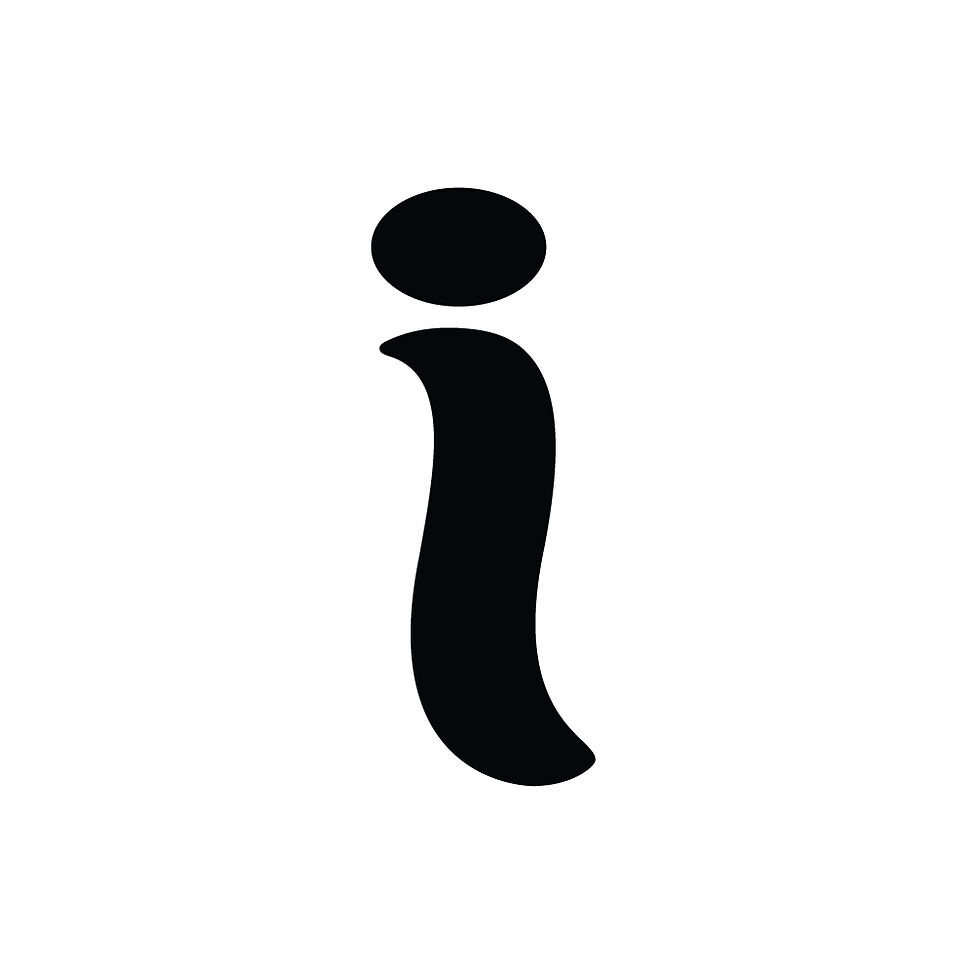
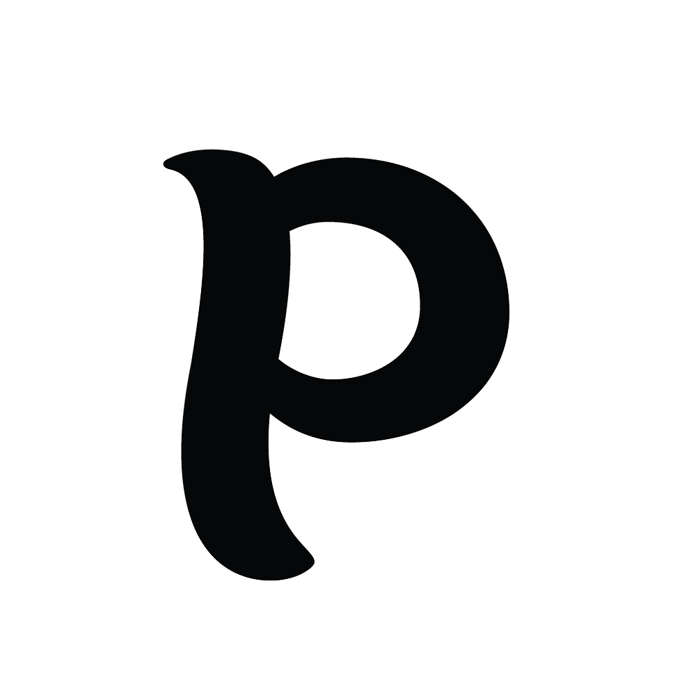
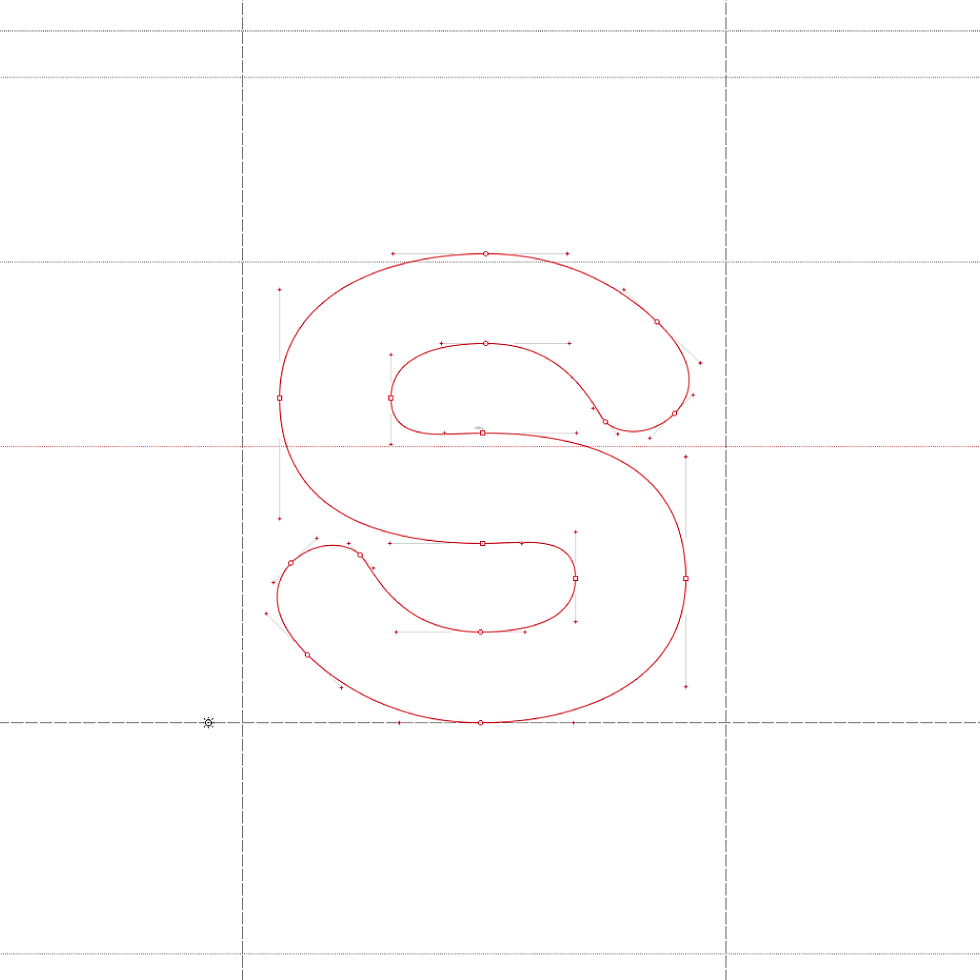
Check out the final alphabet across all 3 production stages : Active Characters, Concept Sketches, & Vectorizing Letters via Fontlab.


AVANT
The joke initially highlighted 2 polar communities by “dumbing down” the vernacular of a character. I flipped the joke by elevating explicit insults into scientific synonyms that would be “above head” for most audiences.
APPAREL
Inspired by American Apparel’s Helvetica collection, I printed the elevated phrases onto plain white T’s via the newly developed font.


